P R O B L E M
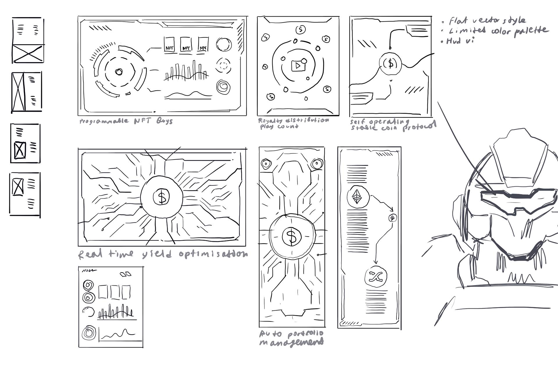
AutoFi is Supra’s on-chain automation product, designed to let smart contracts trigger actions automatically when preset conditions are met. The campaign needed to explain the product clearly without relying on generic crypto visuals, moving beyond the standard coins-and-graphs approach to create a more distinct identity.
A p p r o a c h
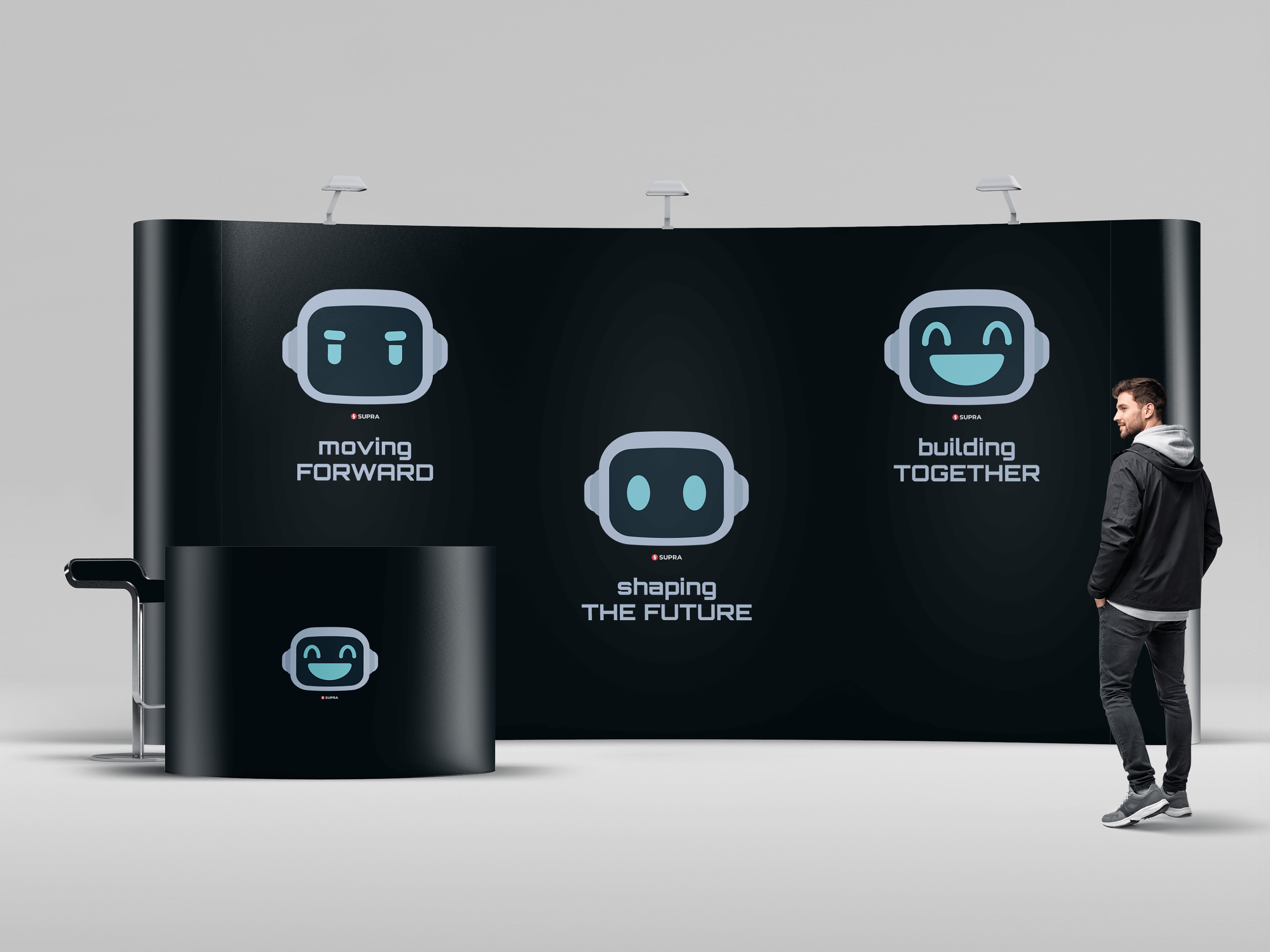
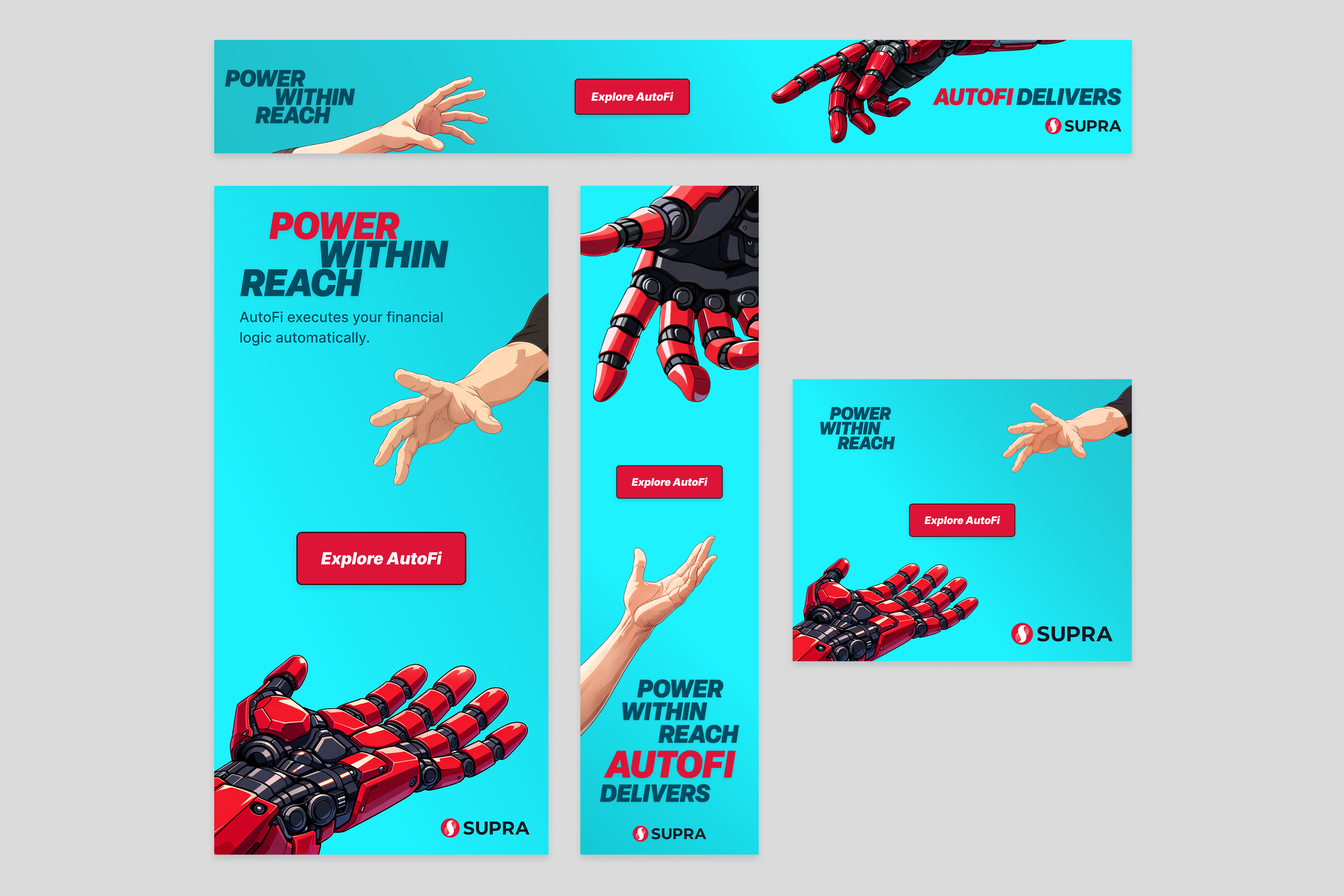
I designed a scalable visual system built around a central concept: human intent supported by automated execution. This is visualized through a human and robotic character, representing the interaction between personal decision-making and autonomous systems.
R E S U L T
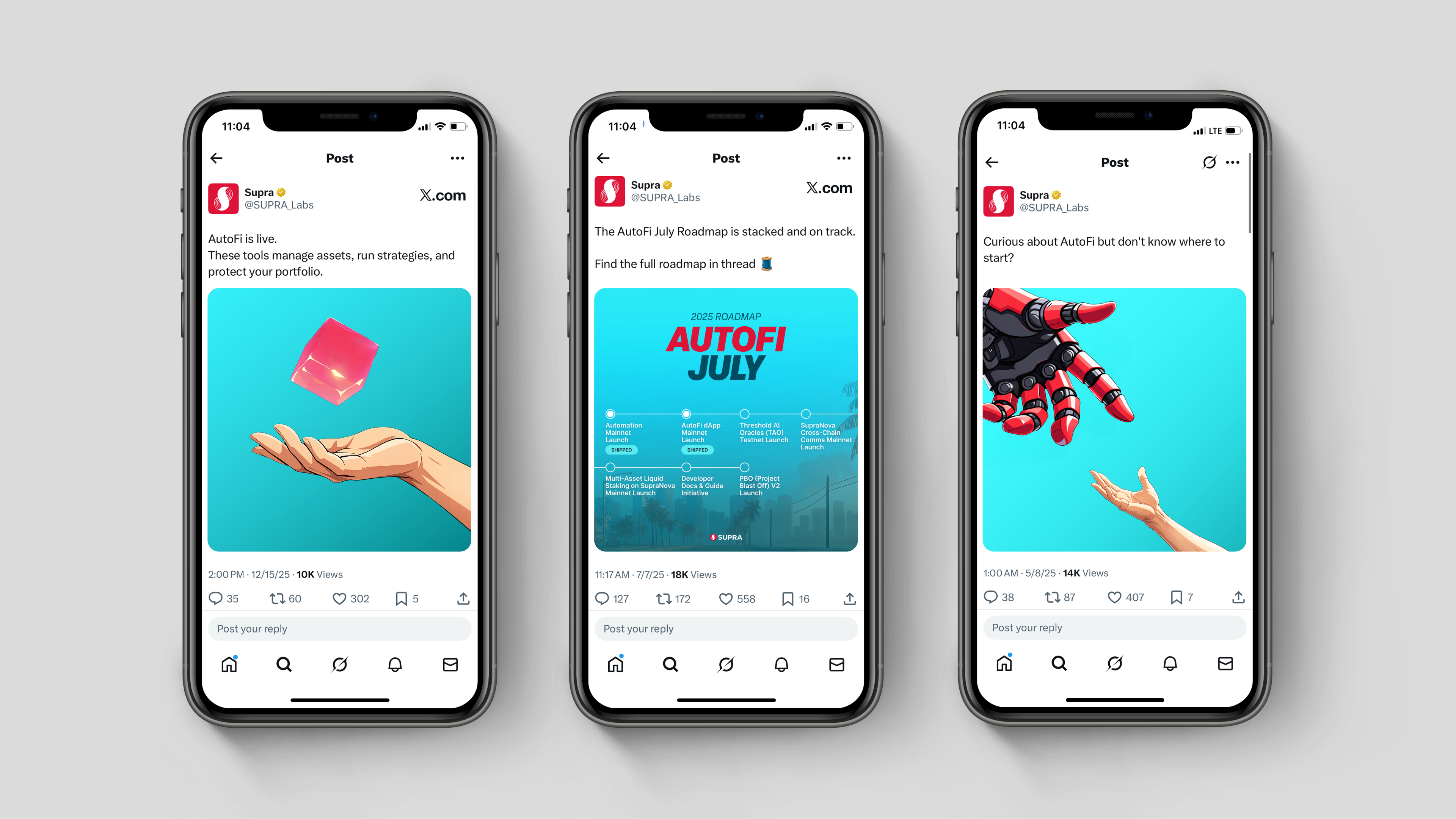
The social posts reached 10K–18K views. The project established a flexible visual system that could extend from launch assets into broader awareness and conversion touchpoints.
R O L E
Graphic Designer & Illustrator
C R E D I T S
Art Direction: Luying Yeo & Kai Pham
Copywriting: Alex Kerrigan
AutoFi is Supra’s on-chain automation product, designed to let smart contracts trigger actions automatically when preset conditions are met. The campaign needed to explain the product clearly without relying on generic crypto visuals, moving beyond the standard coins-and-graphs approach to create a more distinct identity.
A p p r o a c h
I designed a scalable visual system built around a central concept: human intent supported by automated execution. This is visualized through a human and robotic character, representing the interaction between personal decision-making and autonomous systems.
R E S U L T
The social posts reached 10K–18K views. The project established a flexible visual system that could extend from launch assets into broader awareness and conversion touchpoints.
R O L E
Graphic Designer & Illustrator
C R E D I T S
Art Direction: Luying Yeo & Kai Pham
Copywriting: Alex Kerrigan
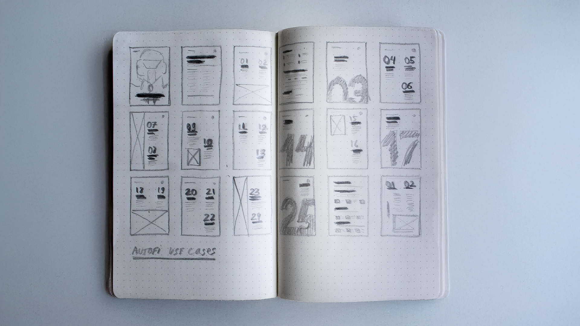
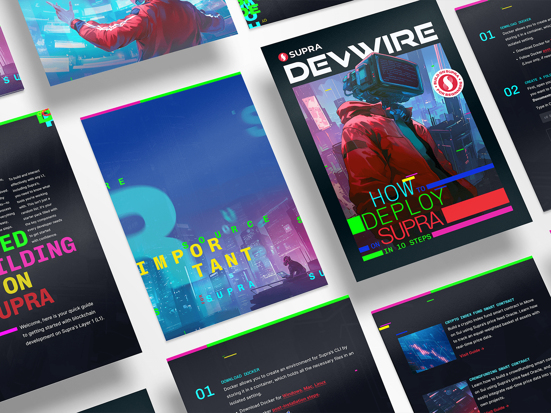
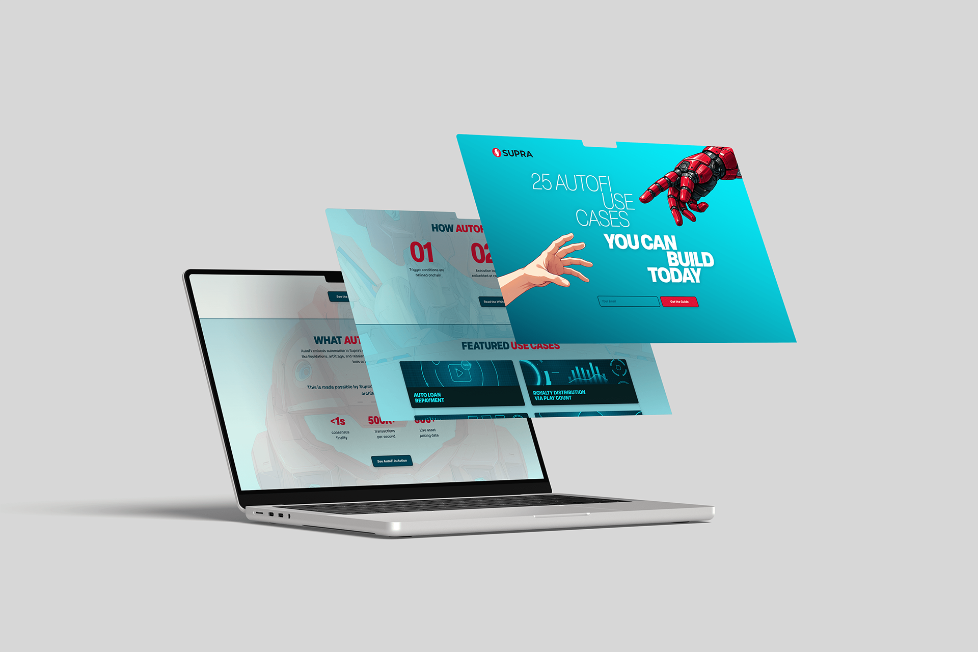
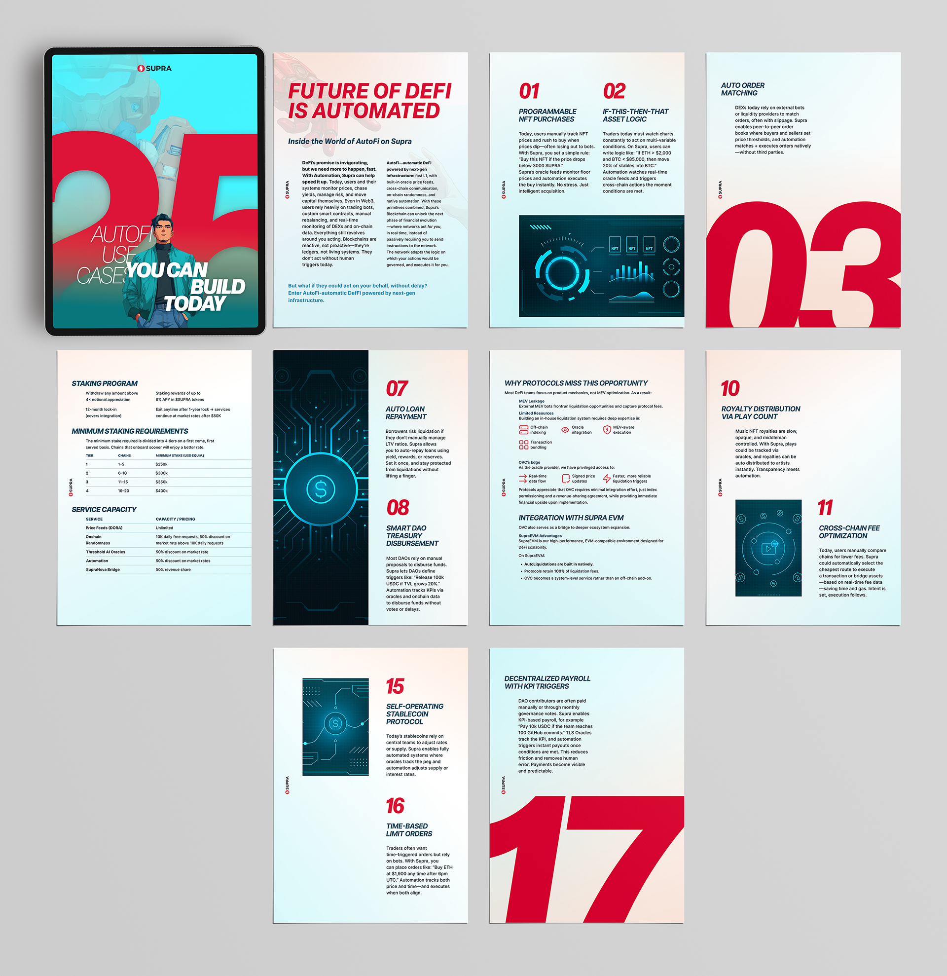
25 AutoFi Use Cases — Selected Pages
I created custom HUD interface graphics in Illustrator, developed the complete typography and layout system in Figma, and generated supporting imagery using Midjourney and ChatGPT, refining them in Photoshop to maintain a cohesive campaign aesthetic.
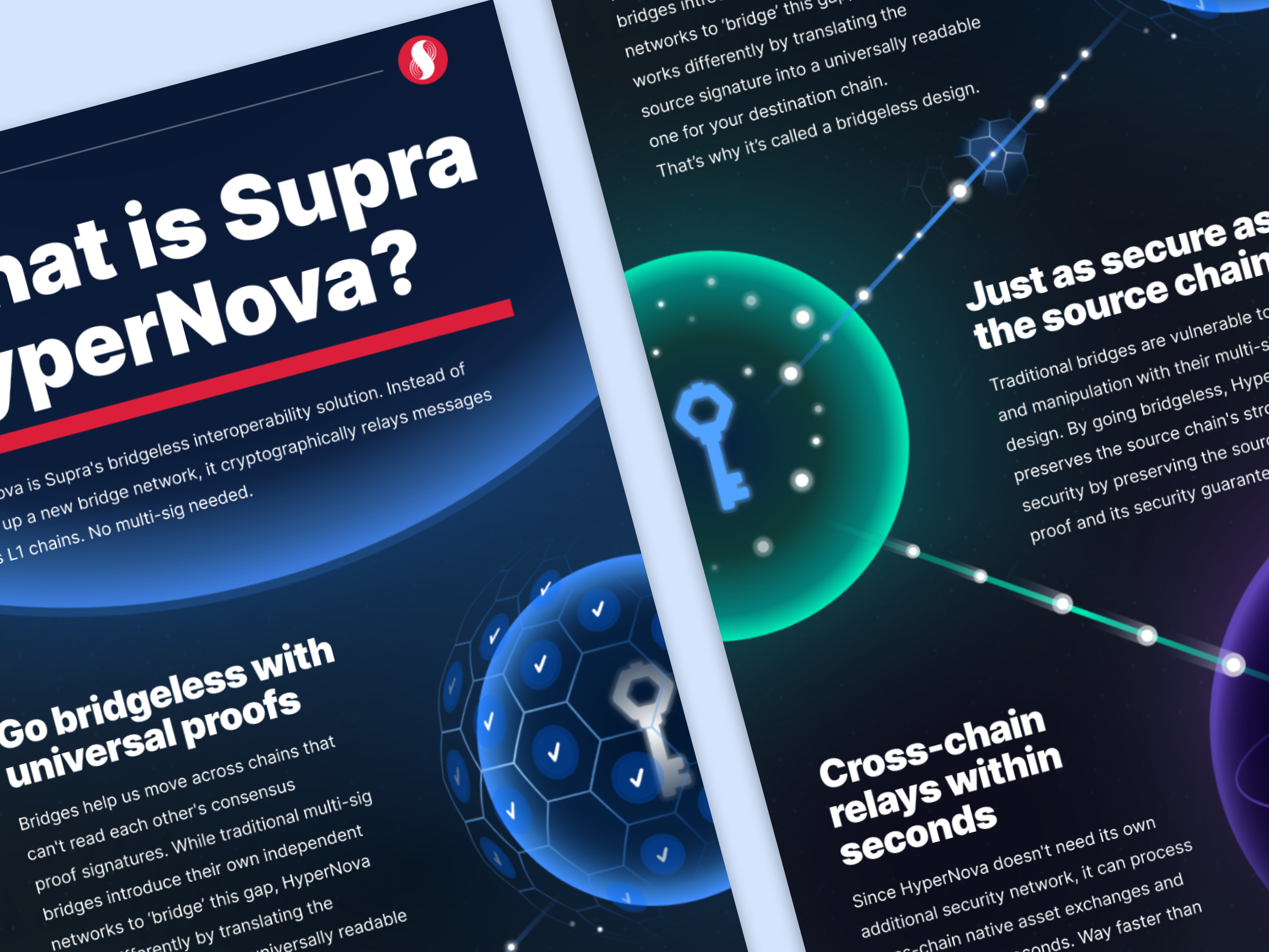
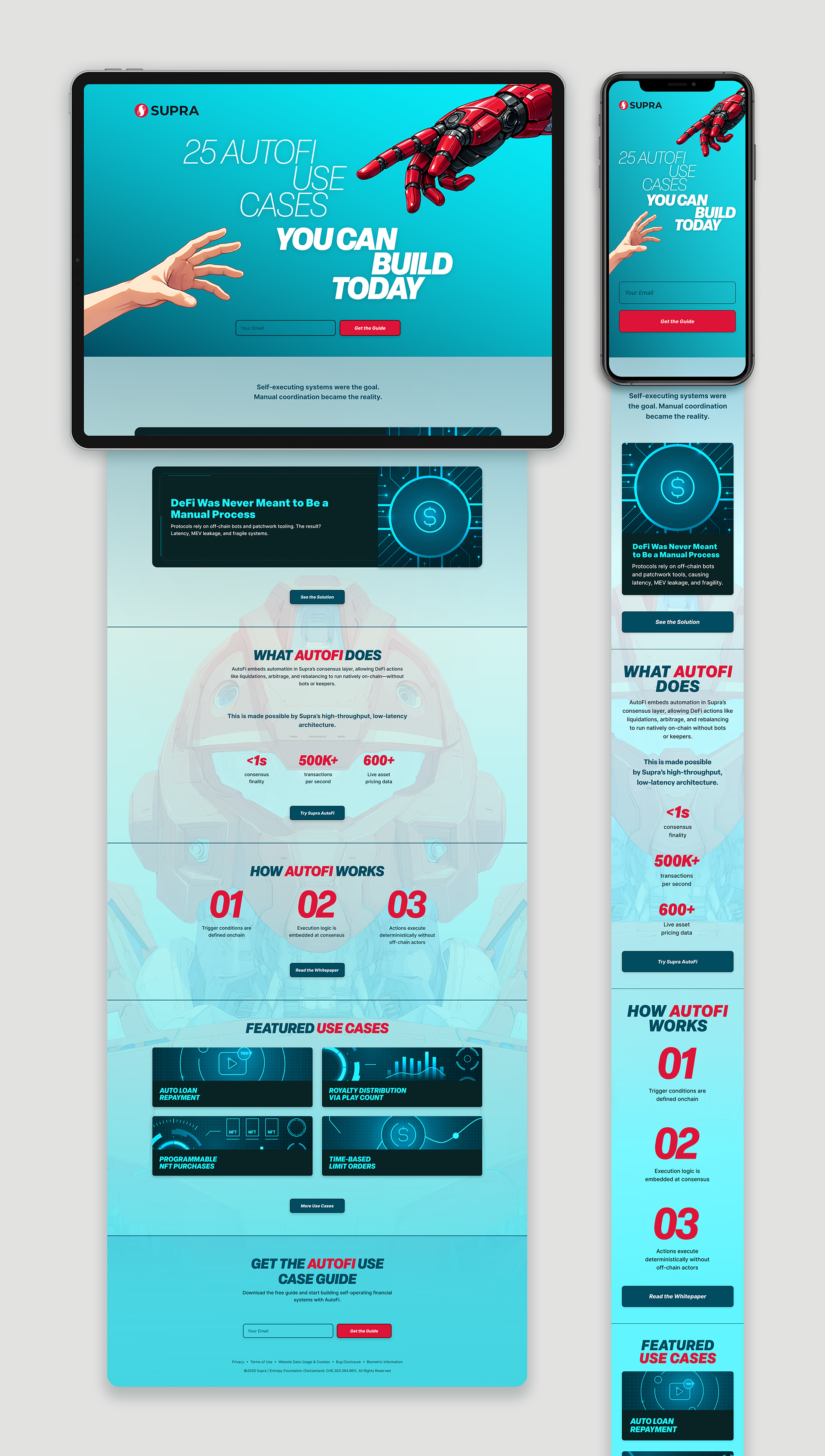
Landing Page
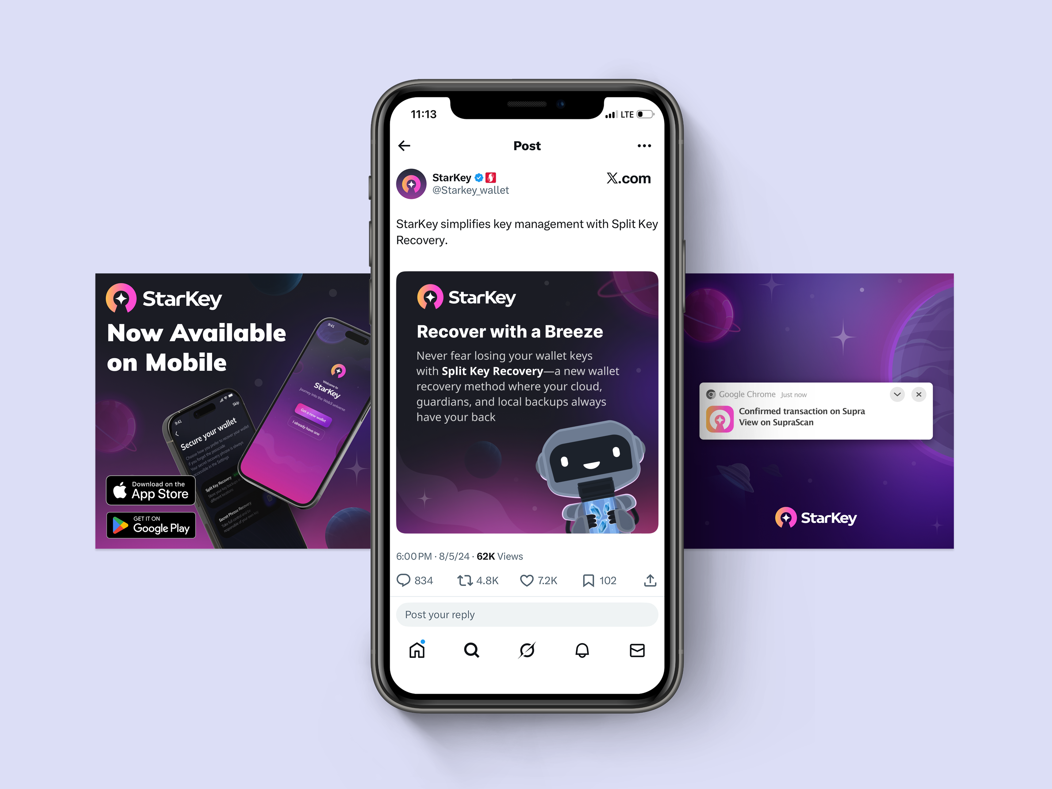
Social Campaign Assets
Paid Media Concept Extensions
Design System Development